More Than Just a Menu: How Smart Design Transforms Restaurants
A menu is one of the first things a customer interacts with at a restaurant, and it does more than just list dishes. It sets the mood, reflects the restaurant’s personality, and even influences what customers order. Good menu design ideas isn’t just about aesthetics, it’s a branding powerhouse that enhances the dining experience and increases sales.
Successful Indian restaurants don’t leave their menu design to chance. Every colour, font, and layout choice is intentional. Take Indian Accent, for example, their sleek, minimalist menu exudes sophistication, perfectly complementing their fine-dining experience. On the other hand, Haldiram’s uses bright reds and yellows, evoking energy and appetite, which align with their fast-paced service.
A premium restaurant might opt for an elegant gold-on-black theme, signaling exclusivity, while a café like Chai Point embraces a more casual, handwritten-style menu that feels warm and inviting. Even the way items are arranged, highlighting bestsellers, placing high-margin dishes at eye-catching spots, plays a key role in guiding customer choices.
From fine-dining establishments to bustling bakeries, smart menu design ensures that customers don’t just order food but connect with the brand. In this blog, we’ll explore how top Indian restaurants craft menus that not only look great but also create lasting impressions and drive business growth.
1. The Power of Menu Colour in Food Businesses
Menu colour psychology plays a crucial role in influencing customer emotions and purchase decisions. Whether it’s a bustling fast-food joint, a cozy bakery, or an upscale restaurant, businesses carefully choose colours to reflect their brand identity, food offerings, and target audience.
How Food Businesses Use Menu Colour Psychology
🍔 Fast Food: Bold & Energetic Colours
🔴 McDonald’s India – Red & Yellow for Appetite & Speed
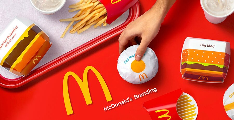
~ Uses a high-energy red and yellow theme to stimulate hunger and create a sense of urgency.
~ Encourages quick decision-making, making it ideal for fast-moving queues.
Best for: Quick-service restaurants (QSRs) and takeaway joints.
🌮 Wow! Momo – Orange & Black for Fun & Freshness

~ The bright orange evokes excitement, while black adds contrast for readability.
~ Highlights bold flavors and quirky branding for an engaging experience.
Best for: Street food-inspired chains and fusion eateries.
🍰 Bakery & Café: Warm & Inviting Hues
🟠 Theobroma – Pastel & Brown for Comfort & Indulgence
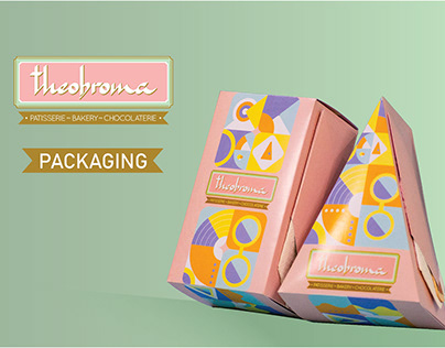
~ Uses soft pastel tones and warm browns to evoke coziness and nostalgia.
~ Reinforces its identity as a comforting dessert and pastry destination.
Best for: Bakeries, cafés, and patisseries.
☕ Third Wave Coffee – Earthy Greens & Browns for Artisanal Appeal
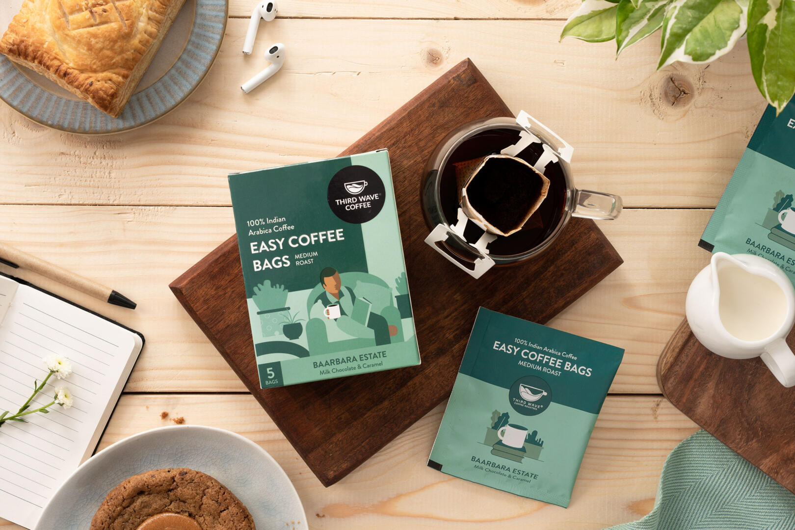
~ Features rich coffee browns and deep greens, representing freshness and craftsmanship.
~ Creates a relaxed atmosphere for a slow coffee experience.
Best for: Specialty coffee shops and artisanal bakeries.
🍷 Fine Dining: Luxurious & Elegant Shades
⚫ Dome, Intercontinental – Black & Gold for Exclusivity

~ A sleek black-and-gold menu reflects premium dining and an elite experience.
~ Reinforces a sense of luxury and sophistication.
Best for: High-end dining and premium lounge menus.
🍷 Taj Mahal Palace – Deep Burgundy & Ivory for Heritage & Tradition

Uses regal burgundy with ivory highlights to symbolize heritage and authenticity.
Aligns with the restaurant’s rich culinary history and fine dining appeal.
Best for: Heritage dining and five-star hotel restaurants.
Lesson: Choose a menu colour scheme that complements your food business.
1. Fast food brands thrive on bold, high-energy colours.
2. Bakeries & cafés use warm, inviting shades for a cozy feel.
3. Fine dining restaurants prefer sophisticated, luxurious tones.
A menu isn’t just about listing dishes, it’s an extension of your brand. Pick the right colours, and you’ll set the right mood for your customers!
2. Menu Design Format: Choosing the Right Layout
A well-structured menu makes it easy for customers to navigate, highlights signature dishes, and subtly guides choices. Indian restaurants use different menu design formats based on their concept and customer expectations.
Examples of Successful Indian Menu Design Formats
📖 Pind Balluchi – Traditional Scroll-Style Menu
Designed like an old Indian royal scroll, giving an authentic North Indian dining experience.
Enhances the theme of rustic, heritage-style dining.
Best for: Heritage-themed restaurants.
📰 SodaBottleOpenerWala – Vintage Parsi Café Menu
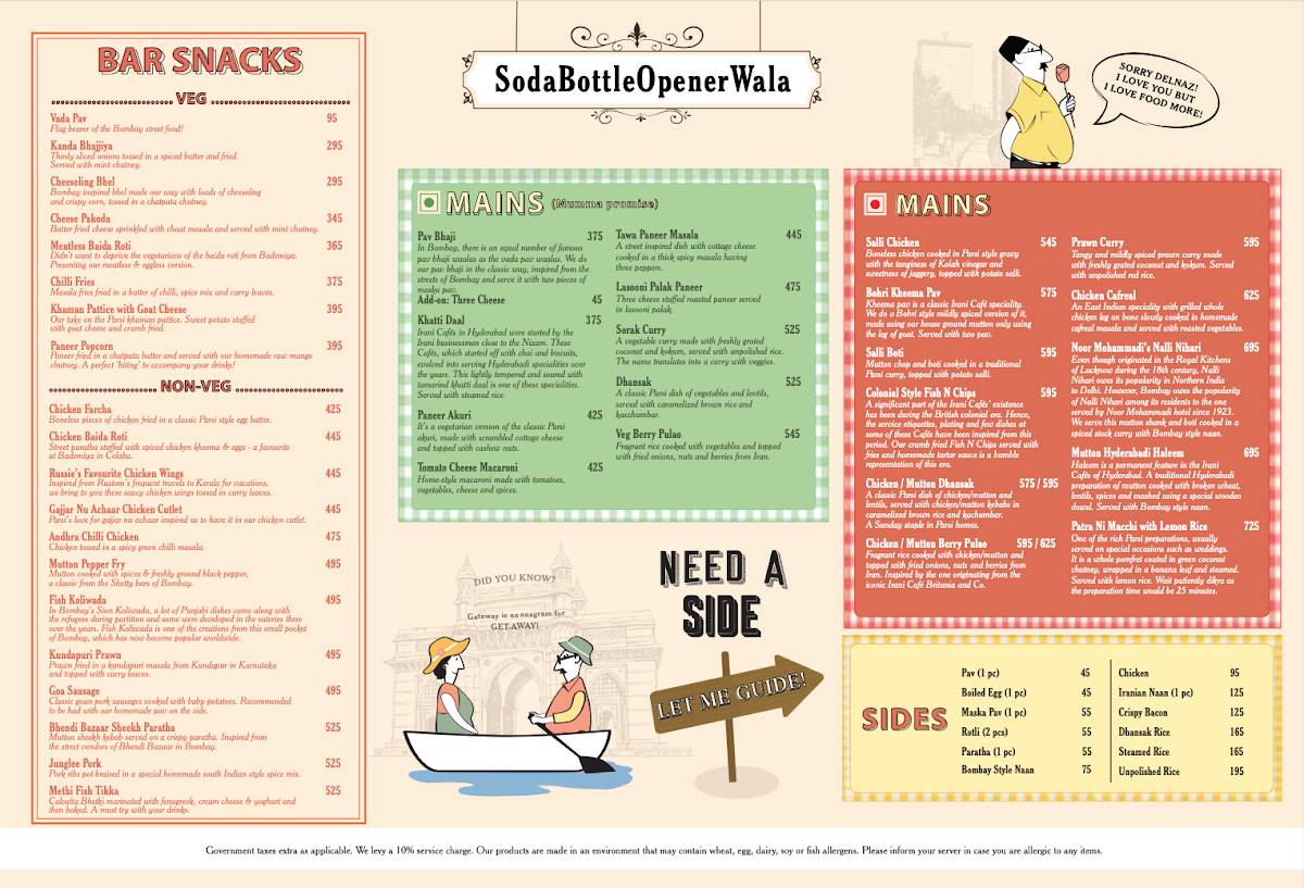
~ Mimics a classic Irani café newspaper, with retro fonts and monochrome images.
~ Reinforces their theme of Parsi nostalgia and Bombay street food culture.
Best for: Menu design for cafes with a vintage theme.
🃏 Tunday Kababi – Minimalist & Icon-Driven Menu
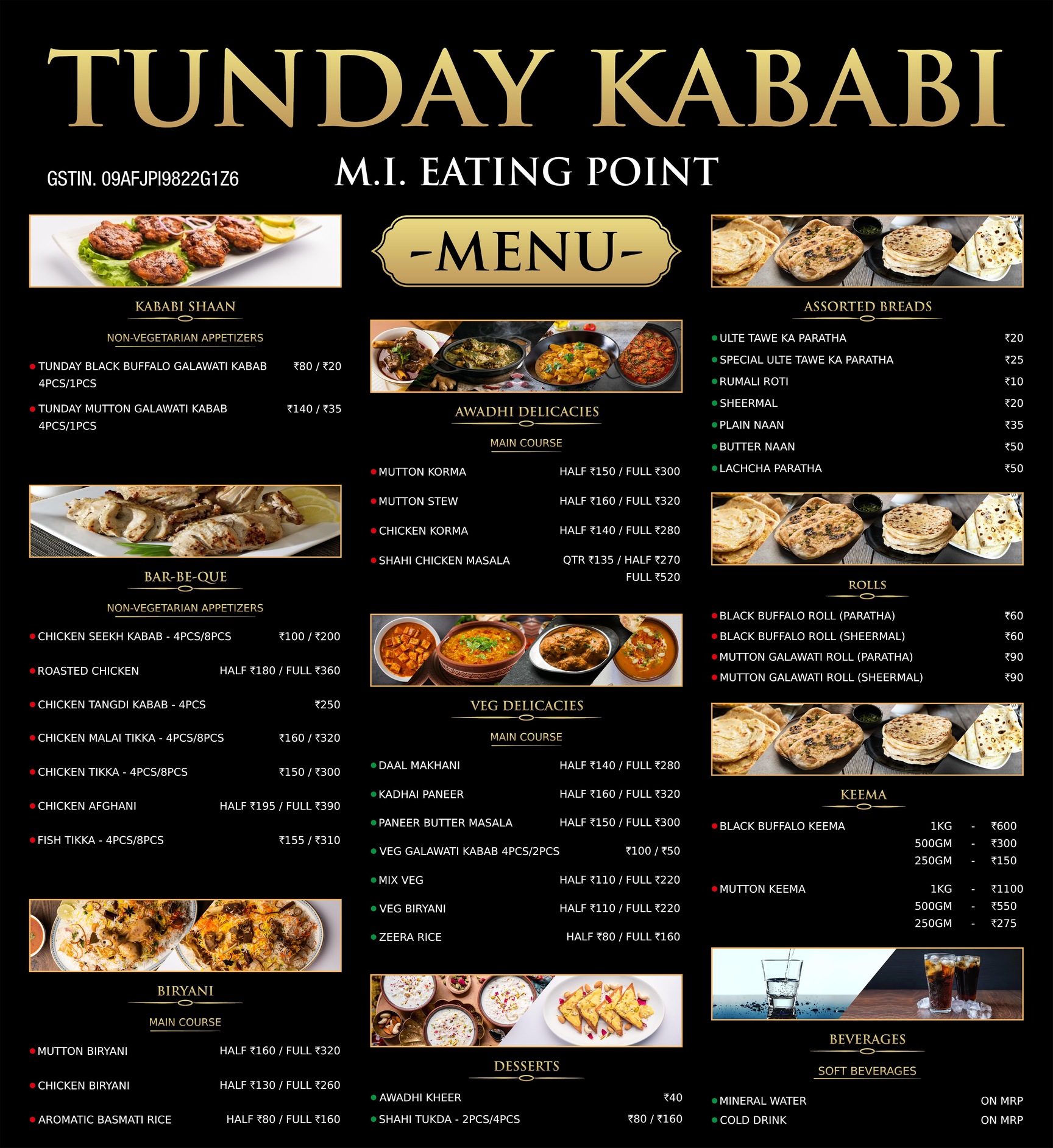
~ Uses simple text with food icons for easy navigation.
~ Focuses on signature dishes without overwhelming customers.
Best for: Menu design for fast food and quick-service restaurants.
Lesson: The menu design format should match your restaurant’s branding and make it easy for customers to engage with your offerings.
3. The Role of Fonts in Indian Restaurant Menu Design
Fonts do more than just display menu items, they shape how customers perceive a restaurant. The right typography reinforces brand identity, enhances readability, and sets the overall mood of the dining experience. Whether a restaurant aims for a regal, modern, or homely feel, font selection plays a crucial role in bringing that vision to life.
How Indian Restaurants Use Fonts in Menu Design
✍️ Dindigul Thalappakatti – Handwritten Fonts for a Traditional Touch
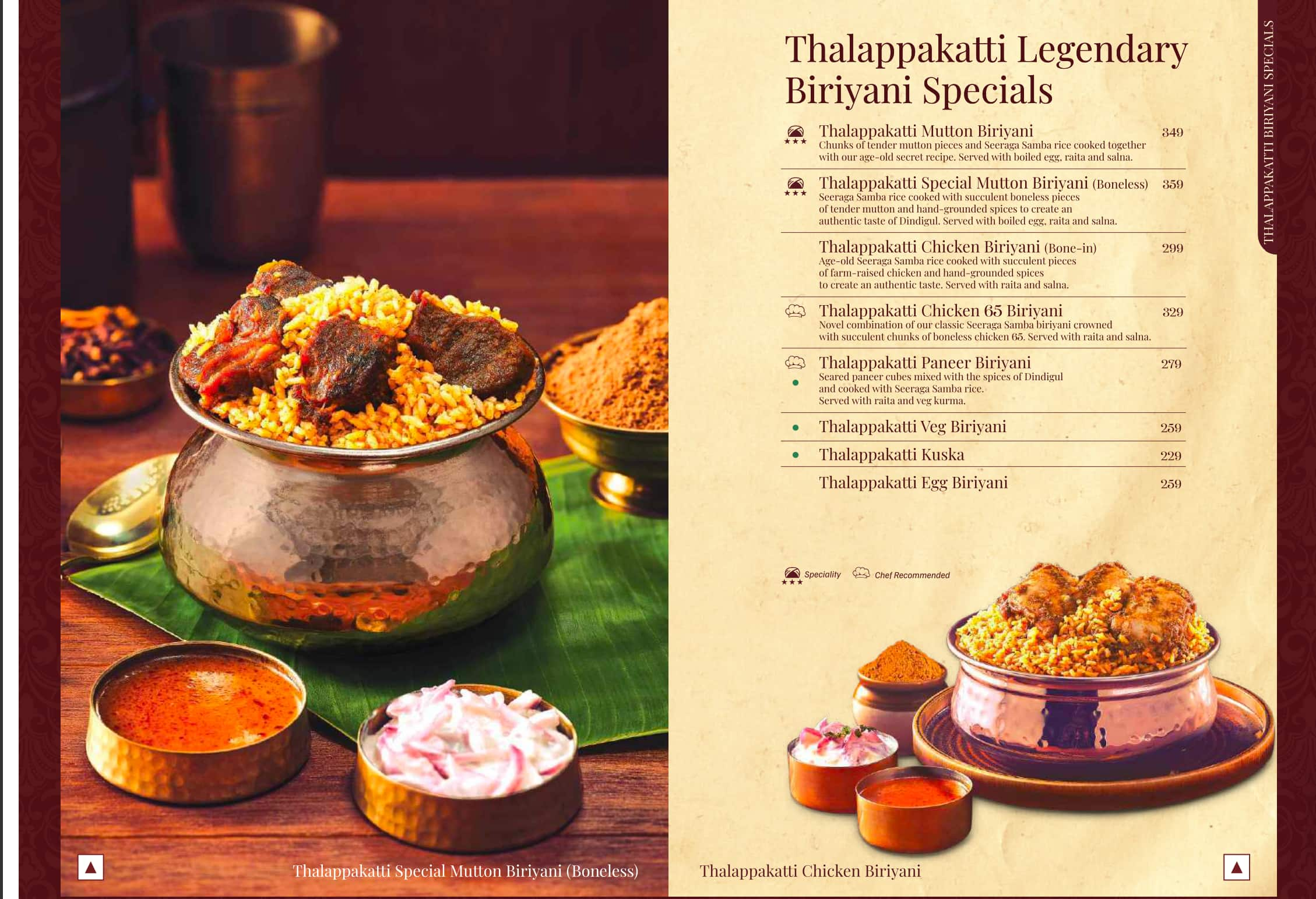
~ Uses handwritten-style fonts that evoke authenticity and warmth.
~ reates a connection with traditional South Indian heritage and homemade flavors.
Best for: Family-friendly South Indian restaurants and regional eateries.
🌿 The Roots Above – Classic Serif for an Elegant Appeal


~ Uses refined serif fonts to evoke sophistication and authenticity.
~ Enhances the brand’s identity as a premium, nature-inspired dining destination.
Best for: Fine-dining restaurants, eco-luxury resorts, and heritage-themed eateries.
🔤 Chaayos – Modern, Playful Typography for a Casual Vibe

~ Uses bold, sans-serif fonts with a contemporary layout.
~ Enhances a relaxed and youthful appeal, perfect for the café-going crowd.
Best for: Modern chai cafés and casual hangout spots.
Lesson: The font choice should reflect the essence of your brand.
1. Classic serif fonts work best for heritage-rich restaurants that emphasize tradition.
2. Handwritten fonts create a personal, homely feel, ideal for regional and family-friendly eateries.
3. Modern, bold typography enhances casual and trendy cafés, making them visually appealing to younger audiences.
A well-chosen font does more than just display a menu, it tells a story about the restaurant’s identity, making customers feel connected to the brand even before they take their first bite.
A well-designed menu is just one piece of the puzzle in running a successful restaurant. But managing orders, tracking inventory, and ensuring seamless operations require more than just great design. This is where a restaurant management software comes in. With an advanced BillBerry POS system, restaurants can streamline billing, monitor sales trends, and even analyze which menu items perform best, all in real-time.
4. Theme-Based Menu Design for Different Indian Restaurants
A restaurant’s menu isn’t just a list of dishes, it’s an extension of its brand and atmosphere. Many Indian restaurants design their menus around a central theme, reinforcing their identity and making the dining experience more immersive. Whether it’s a rustic dhaba, a community-driven eatery, or a modern brewery, themed menu designs help create a memorable impression.
Unique Themed Menus in India
📜 Amrik Sukhdev – Handwritten, Chalkboard-Style Menu for a Dhaba Experience
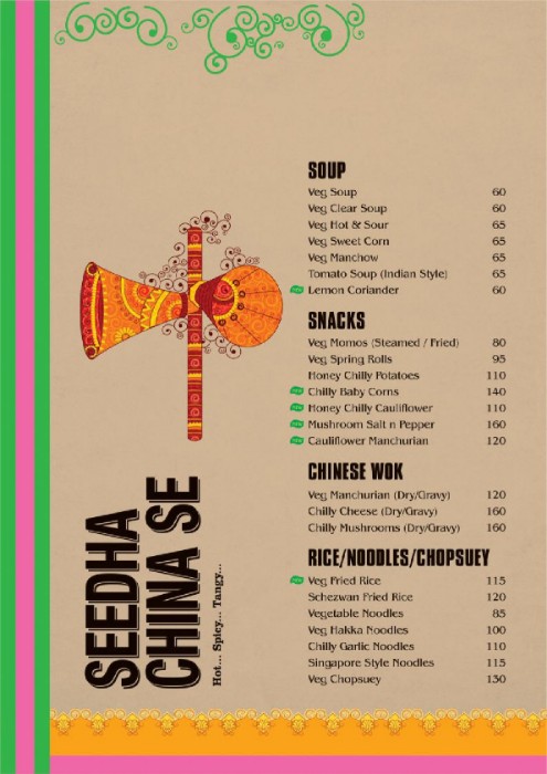
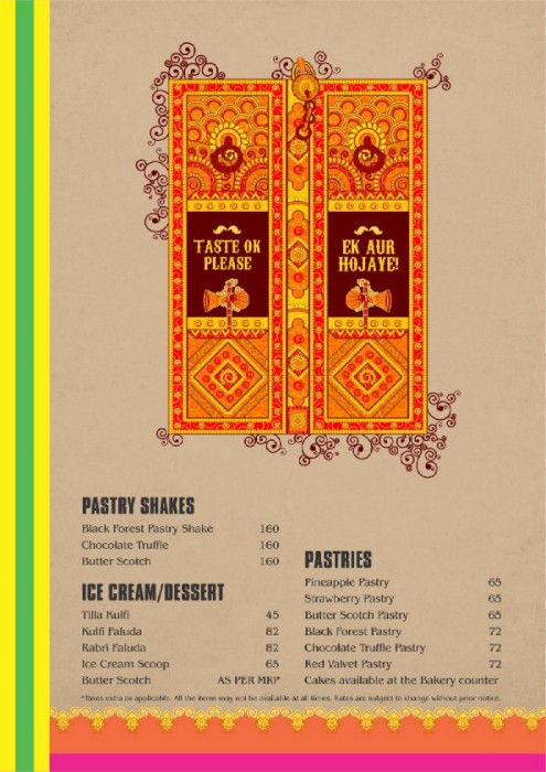
~ Features a simple, handwritten chalkboard-style layout, reminiscent of highway dhabas.
~ Creates a rustic and homely appeal, reinforcing the comfort food experience.
Best for: Roadside dhabas, Punjabi eateries, and street food joints.
🌊 Kovallam – Coastal Elegance on a Plate
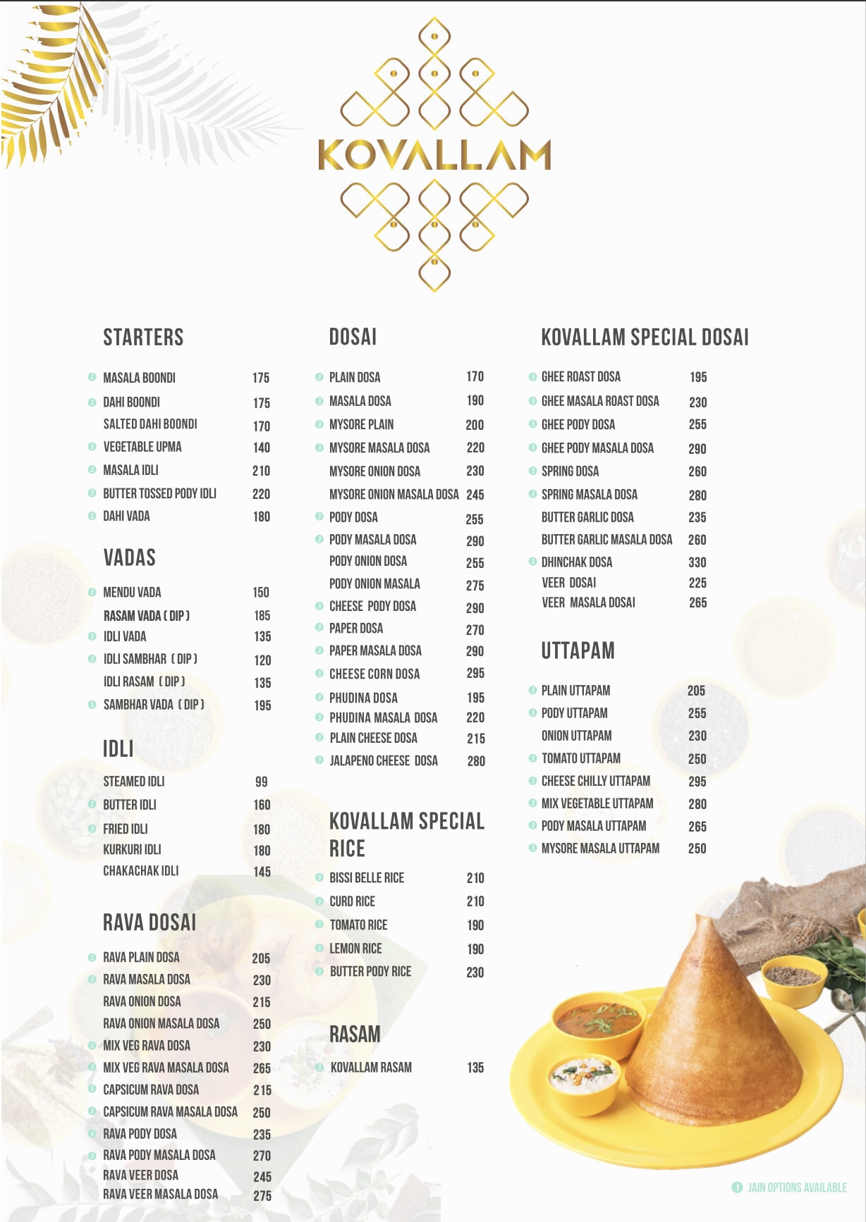
~ Uses refined serif fonts to reflect tradition and sophistication.
~ Captures the essence of premium coastal dining with a serene touch.
Best for: Seafood fine-dining, beachside resorts, and heritage coastal eateries.
A menu isn’t just about listing dishes, it should transport diners into a cultural experience. Incorporate traditional motifs, hand-drawn illustrations, and heritage-inspired typography to make your menu feel like a piece of history rather than just a guide to food.
🎭 Toit – Story-Driven, Artistic Brewery Menu
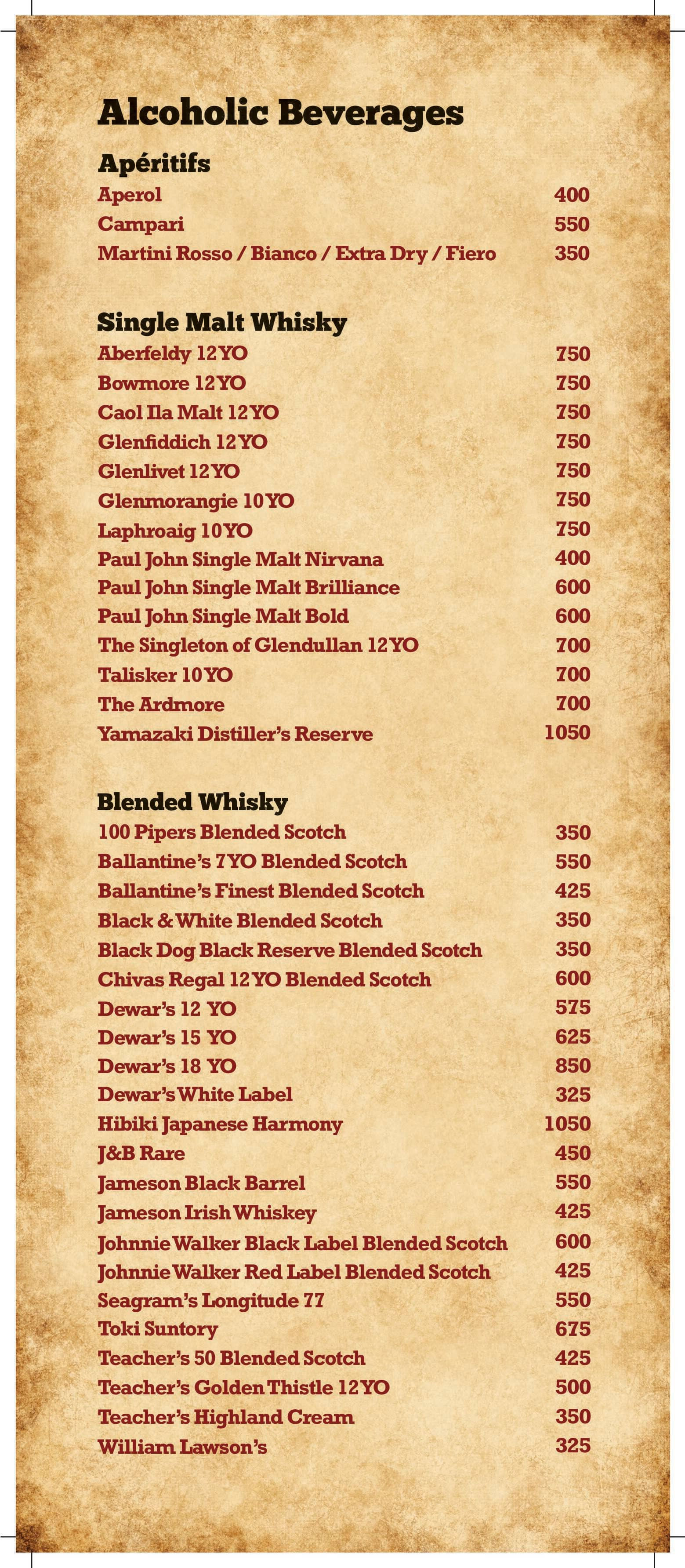
~ Integrates artistic illustrations and mythological references to match the brewery’s rustic interiors.
~ Uses bold, themed fonts and textured backgrounds for a grand visual appeal.
Best for: Themed bars, breweries, and fusion dining spaces.
Lesson: A well-thought-out theme-based menu enhances brand recall and customer engagement.
1. Dhabas & street food eateries use handwritten or chalkboard menus for a raw, authentic feel.
2. Traditional family restaurants opt for structured, community-style menus to highlight cultural dining experiences.
3. Modern bars & breweries incorporate artistic and storytelling elements to match their themed ambiance.
When the menu design ideas align with the restaurant’s identity, it doesn’t just inform customers, it immerses them in the dining experience, making it more memorable and enjoyable.
5. Smart Pricing & Layout Strategies in Indian Menus
Menu design isn’t just about aesthetics, it’s also a psychological tool that influences customer choices. Indian restaurants use strategic pricing and layout techniques to guide customers toward high-profit items, make dishes seem more affordable, and subtly encourage larger orders.
How Indian Restaurants Use Smart Pricing & Layout Techniques
💰 MTR (Mavalli Tiffin Rooms) – Removing Currency Symbols to Reduce Price Sensitivity
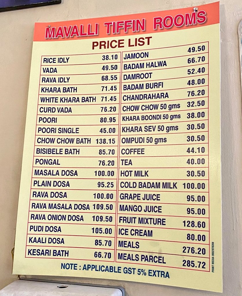
~ The menu omits the ₹ symbol, making customers focus on the food rather than the cost.
~ This strategy reduces price resistance, making diners more likely to order based on preference rather than budget.
Best for: Traditional restaurants and heritage eateries looking to create a premium dining experience.
📍 Haldiram’s – Strategic Placement of Profitable Dishes
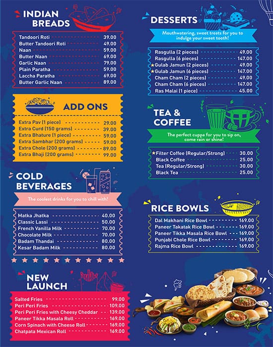
~ High-margin items are placed in the top-right corner of the menu, the spot where customers’ eyes naturally focus first.
~ Bestseller and combo meals are highlighted to increase their appeal.
Best for: Fast food chains and casual dining restaurants aiming to maximize sales of signature dishes.
🃏 Behrouz Biryani – Decoy Pricing to Make Mid-Range Items More Attractive
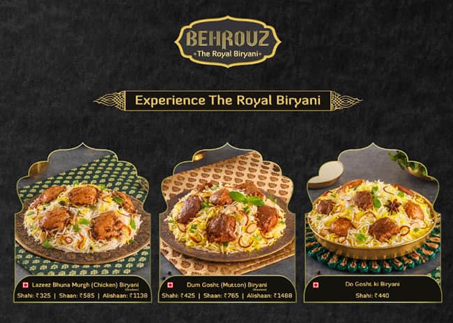
A premium-priced royal biryani thali is listed to make regular biryanis appear more affordable in comparison.
This technique subtly nudges customers toward ordering mid-priced items, increasing overall revenue.
Best for: Biryani chains, QSRs, and restaurants with tiered pricing models.
Lesson: Smart menu pricing and layout strategies can subtly influence customer spending habits.
1. Removing currency symbols makes prices feel less intimidating.
2. Placing high-profit items strategically increases their visibility and likelihood of being ordered.
3. Decoy pricing makes mid-range dishes seem like better deals, driving sales without lowering profits.
By using these psychological tricks, restaurants ensure that their menus don’t just look good but also work as silent sales tools, encouraging customers to order more and enjoy a well-curated dining experience.
Why Menu Design Ideas Matter for Indian Restaurants
A menu is more than just a list of dishes, it’s a crucial branding tool that shapes customer perception, enhances the dining experience, and directly impacts a restaurant’s profitability. A thoughtfully designed menu not only attracts the right audience but also subtly guides customer choices, increasing sales and brand recall.
Top Indian restaurants invest in strategic menu design by focusing on:
✅ Colour Psychology – Choosing colours that evoke the right emotions and influence appetite.
✅ Layout & Format – Using menu structures that align with their brand identity and improve readability.
✅ Typography – Selecting fonts that enhance the restaurant’s theme and ambiance.
✅ Thematic Design – Creating immersive menu experiences that strengthen brand storytelling.
✅ Pricing & Placement Strategies – Implementing smart pricing techniques to maximize profitability.
If you’re considering a menu revamp for your restaurant, drawing inspiration from successful brands can help you create a menu that not only looks appealing but also enhances customer engagement and boosts revenue. A well-crafted menu is a silent yet powerful marketing tool, make sure yours works in your favor!
——————————————————————————————————————————————
While a thoughtfully crafted menu enhances branding and customer experience, restaurant success depends on efficiency behind the scenes with great menu design ideas. Investing in a smart restaurant management system helps optimize operations, reduce errors, and improve customer service. From digital menus and automated inventory tracking to real-time order management, an advanced POS system ensures smooth and profitable restaurant operations. If you’re looking to enhance your restaurant’s workflow, explore how the right technology can simplify processes and boost your revenue with BillBerry POS! Contact BillBerry POS and Book Your Free Demo!


